![]()
For this project, we were asked to make a rough draft of a logo. For my logo, I really wanted to make something that a company could use on water bottles, t-shirts, mouse pads etc. It could be something to promote my brand, blog or company.
My draft for this project turned out differently than my original sketches which can be seen here. As stated in the page I earlier linked to, I was really hoping to put together some symbols of what it means to be in the Pacific Northwest.
For inspiration on his project, of course I read all of this week’s class readings on logo design, which was very helpful in learning about simplicity and other design aspects. I also researched brands that represent similar companies, such as Pacsun, Volcom, Yonder Washington, etc. to see if they had any pieces of their logos that I could draw from.
I am going to list the steps that I used to create this logo, so you can see what my basic design process was.
- Create a 900 by 900 px workspace/artboard
- Find a photo of a tree that I had in my camera, and use it to trace a tree with the pen tool, making sure to lock the image in place before tracing it.
- Move the traced image of the tree aside and create the waves. This was tricky, but I used two circles from the polygon tool, and placed one on top of the other, slightly askew. When I had created a crescent that I liked, I used the shape builder tool to get rid of the excess circles.
- Once I had the general shape of the waves, I used the direct selection tool to move around some of my anchor points, making the wave look more natural.
- I then held alt and copied and resized the second, smaller, wave to mirror the first wave.
- I set the waves aside, and created a large circle around my tree shape that I had previously traced. I noticed that I wanted the tree to be larger, so I pulled it upwards using Control+T.
- When I had the tree in place in my circle, I put the waves towards the bottom of the circle.
- When all looked good there, I made a second circle around the one containing the waves and the tree.
- I then used the shape builder tool to combine both circles, the trees, and the waves, so that they would all be one closed object.
- I then used the line segment tool to create a flat line on the bottom of the circle, and used the direct selection tool as well as control+x to delete all of the remaining circle.
- Now, I began making triangles using the polygon tool around the circle, to mimic sun rays, about halfway into this process I decided I didn’t like it, and they were deleted. Hence why you can’t see them.
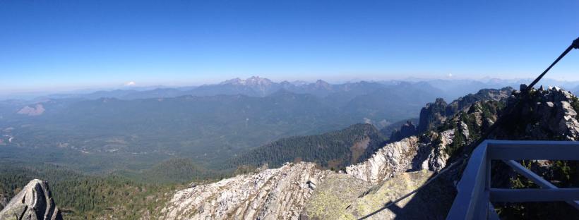
- After looking at some inspiration, I decided my logo needed mountains, so I traced the top of a picture of Mt. Pilchuck, that I took on a hike with the pen tool, in order to get the nice mountain shape.
- Finally, I combined my traced mountains to my already created logo with the shape builder tool.
- Next, I added a gradient of colors that I wanted to look at for possible color options, and chose a font to write “Pacific Northwest” on the bottom. Both the gradient and the font are subject to change still, and I am open for suggestions.
- I then exported my logo using file export, and here it is.
This was a very long process, and its hard to make step by step directions in 300-500 words. So, here is as best of a summarization as possible. I can’t wait to see where my logo will go!

Hi there! I really like your whole idea for your blog and I might even check it out when I’m interested in taking an adventure in the future. 🙂 Unfortunately, I was apparently too nice in my previous peer reviews so I guess I have to be a little meaner. I’m sorry in advance!
I really like the outline of a circle to contain your logo. It keeps it nice and tight so that on a t-shirt or water bottle as you said so that it doesn’t overwhelm anyone who looks at it. It’s nice and to the point. However, I don’t love the color situation. I like the gradient, but I don’t really understand why it goes from green to brown then back to green then back to brown. Maybe try more of an ombre effect, where it just fades casually from green to brown? Perhaps also considering a darker green. One of the most beautiful things here in Washington is the deep evergreen color so maybe try hit that more on the head!
I’m also not super crazy about the font. It seems playful and slightly unprofessional. Washington has this certain majesty about it, so maybe try to pull more of that into your font selection. If you haven’t used it before, I use dafont.com to download the fonts I use! They have a really wide selection and it’s all free.
I’m sorry if this was too mean! I hope it wasn’t. I’m really bad with criticism haha.
LikeLike
Hey Sam!
I like the colors you chose for your logo and the gradient too. The colors go with the idea of the Pacific North West, but the gradient you used give it a unique look.
I also like how you used mountains, waves and trees in your logo. Those are all things that make me think of the Pacific North West.
The font you chose gives it a fun look, but I think maybe abbreviating the words Pacific Northwest to PNW might keep it a little simpler. Especially since the colors and symbols you are using kind of lead you to think about the PNW. Also the abbreviation is pretty well recognized.
I would suggest maybe finding a way to incorporate the words in the circle or find another way to continue the circle all the way around. I am not sure why, but I think it would look nice.
I think you are off to a good start.
-Brittanie
LikeLike
Hi Sam, (I saw in your “about me” section that most people call you Sam!)
I love the topic of your blog, and its overall design is fun and appealing! I think you did a really nice job on your logo draft and writing a description of your design process.
One strength of your logo is the overall outline of the design. Your mountains, tree, and waves all look great. The lines are clear and scalable, and I can easily tell what each shape is supposed to be. Nice job with those tracings! And I am sure that creating waves would be easier said than done, but I think you did a nice job with them. I found Illustrator to be fun but tricky.
One suggestion I have is playing with the color scheme some more. I like the idea of using green and brown colors to represent the main colors you’d find in the Pacific Northwest. However, I think trying a forest green color and maybe a softer brown color that complements the green better could be nice.
Another suggestion I have is experimenting with the size of the waves. I think the general shape of your waves is great because you can tell that they are waves without reading your description. Possibly resizing the lower wave to make it a little bit smaller than the other one could give a more of a “crashing” effect. Just something to play around with!
– Anna
LikeLike
Hello Sam,
Great work on your logo! I really like it, it does have a Pacific Northwest feel to it. I think the gradient shades of green were a great idea, and the lettering is playful and fun.
As for suggestions, I think the waves of the water are a little too harsh. Maybe you could make them small or maybe remove them all together to give the logo a cleaner feel. I really don’t know, but I think it just looks off to me. Like we learned in our readings though, it’s all subjective so if you love it, keep it!
For my second critique, I was suggest playing around with making the outer circle smaller. I think if the line were thinner the mountains and the tree would pop more.
All in all, I honestly think you did a great job and I think you made something to be proud of!
~Amanda
LikeLike
Okay, it’s my turn again to self assess my work. I am fairly happy with this logo, but love some of the suggestions I have. I like the suggestion of a more professional looking font. Washington is very “majestic” with it’s beauty, and it would be nice to have a font to match. I am going to check out Dafont.com. Also, I definitely agree with these ladies that I need a more forest-y green. I think that if anything, I will try and take the gradient from a darker green to a lighter one, and take the brown out all together, if I do a gradient at all. A few people also commented on maybe changing some of the sizes of the waves. I am going to try to do this without recreating the whole logo first, but if that fails I may try to start a new one. I also like how Brittanie said to put the words incorporated into the circle. However, I didn’t want my logo to look too much like our tutorials, and I have a feeling that may happen if I do that. I am excited to get working on this and see what progress I can make.
LikeLike
Sam this is great. I can see this on a web page, or on the back window of my friends car heading to Stevens pass. It has wide appeal.
Like with most of the logos i have looked at in this class I have found that the designs with the most simplistic, direct approach often look the most refined and clean. yours is no exception. It connects with your blog perfectly and give the viewer a great idea of what to expect when they look at the logo
Im struggling to think of something to change, or alter. Maybe (because i love animals) add an eagle soaring majestically though the sky, contemplating its existence as it explores the great pacific north west and its vast beauty and ever changing landscapes. It knows it exists to be, but at what level. How can something so small be part of something so large. Does it really matter in the big picture? With pressures to leave the nest, catch the largest salmon, and find a mate to lay eggs of its own, he really hasn’t just been. Hasn’t really existed. In the end will any one notice? Does anyone care? His life is close to half over already and what does he have to show for it? A cool white head? sure but what does that really mean. This could all just be a scenario in a turtles dream, and no one matters or exists.
Or touch can possibly add a second color. I think a medium brown would set against the green really well.
Good luck. It looks great and when its done I want a bumper sticker.
LikeLike